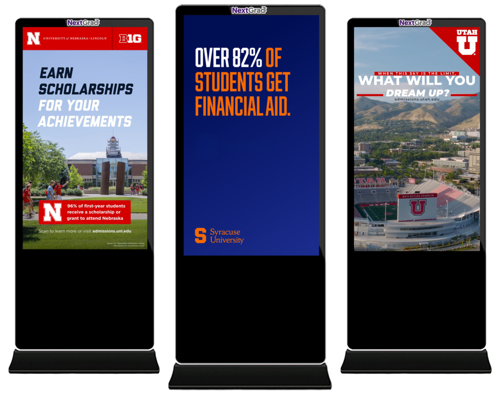
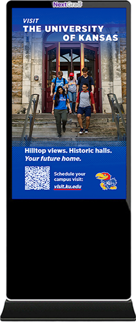
Reach & Engage Future College Students Where It Matters Most

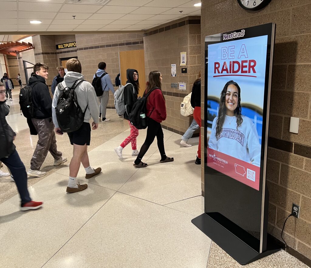
High-impact placements in hallways, cafeterias, and common areas where students naturally gather.
90% of students exposed to NextGrad screens have applied to a featured program.
50% of students discovered a college or program they weren’t previously aware of through our platform.
We help leading institutions reach elusive high school students, when and where they’re making critical decisions about their future.


We strengthen student recruiting by promoting local, regional, and national programs to high school students, when and where they’re making critical decisions about their future. Our network lives inside the high school building, in high traffic/high visibility locations guaranteed to immerse and engage students multiple times a day during the school year.
NextGrad is embraced by parents and educators, because we inform and inspire high schoolers to continue their educational journey.


The NextGrad media network provides an exceptional opportunity to military recruiters interested in reaching high school graduates.
Our media network is located in high-traffic locations inside high school buildings and is a highly effective way to inform prospective graduates about military service, training, compensation, tuition reimbursement, and leadership and career opportunities.
We support recruitment efforts for all branches of the Armed Forces, including the Army, Navy, Air Force, Marine Corps, Space Force, Coast Guard, National Guard, and others.

NextGrad’s digital out-of-home (DOOH) network is fully integrated with all major omnichannel programmatic buying platforms, making it easier than ever for advertisers to reach high school students where they make critical decisions about their future.
Higher education institutions, military recruiters, public health organizations, and brands can seamlessly activate campaigns across 1,100 high schools in 80 media markets through their preferred programmatic partners. With advanced audience targeting and real-time bidding, advertisers can maximize their reach, optimize performance, and drive meaningful engagement with 14-18-year-old students and key influencers like parents, counselors, and educators.
By combining the power of programmatic efficiency, real-time data, and nationwide scale, NextGrad transforms high school advertising into a dynamic, measurable, and results-driven media opportunity. Whether you’re looking to boost enrollment, increase awareness, or connect with the next generation, our programmatic availability ensures your message reaches the right audience—when and where it matters most.
Ready to launch your campaign? Advertise with NextGrad through your preferred omnichannel DSP today.

We’re excited to work with you.